CI Guidelines
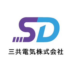
About the Symbol Mark
The initials "S" and "D" of the company name have been designed as a single line. This single line represents the consistency of moving towards the future alongside UV. The dashed line in the shape of "S," inspired by "Sankyo," incorporates three elements, symbolizing a fluid connection to the future. The flowing shape of the "S" reflects our commitment to pursuing sustainable growth while flexibly adapting to change. Additionally, the dashed part symbolizes continuity connecting the past to the future, expressing the strength of a "forward-moving company" as a whole. The colors combine purple, representing UV lamps, and blue, symbolizing trust, to convey the corporate image. Purple signifies high technical capability and expertise, while blue indicates trustworthiness and sincerity. The combination of these two colors establishes a corporate image that harmonizes innovation and trust, creating a consistent visual identity across the entire brand.
Inquiry about this news
Contact Us OnlineMore Details & Registration
Details & Registration
Related Documents
Related Links
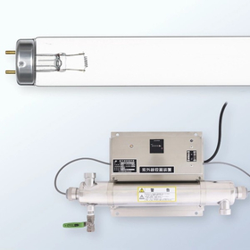
Related catalog(1)

Distributors